Portfolio
A story-first portfolio website for a product designer. I was my own client, and this is how I briefed myself.
- Client
- Me. I wrote the brief, approved the work and carried the cost.
- My role
- Strategy, design and build
- Built with
- HTML, CSS, JavaScript, GitHub, Netlify, Google Analytics 4
- Status
- Live · 2026
The brief
Two kinds of visitor arrive from a shared link: a recruiter and a freelance client. Neither searches for me. The recruiter has other portfolios open and decides quickly. The first screen has to work with no context.
What I built
Four calls I made as my own client, each with a reason.
Story first
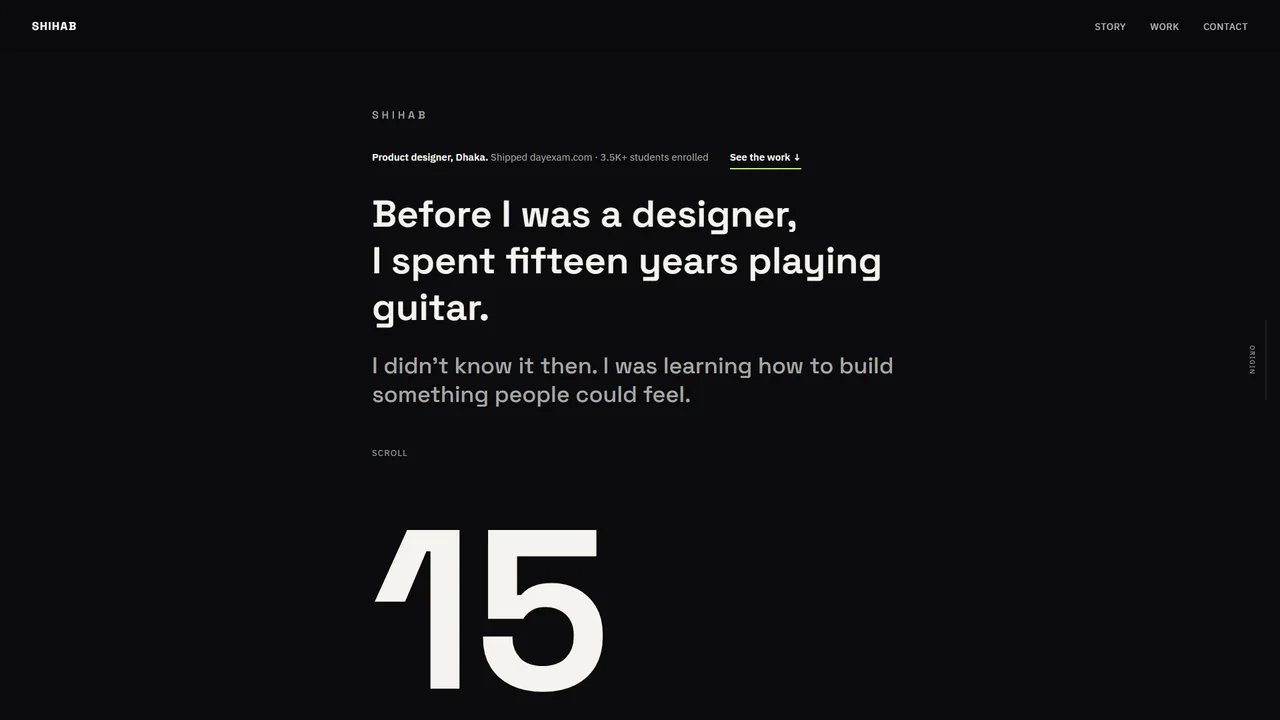
A list of projects looks like every other portfolio. The home page opens with where I came from (fifteen years of guitar, then design) and moves on to the work.
Dark, editorial, one accent
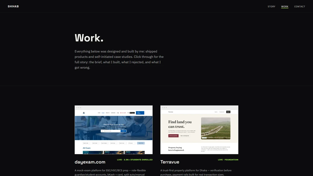
Near-black, warm off-white, one lime accent, two font families. No gradient blobs, no glass.
Real screens, not live embeds
Live iframes broke at some window widths and made the page heavy. Local screenshots replaced them.
A cold first screen
I added a line under my name with the shipped proof, so a stranger sees evidence first.
The real problem
My first draft read like a company website. Then it read like a resume: text and one stock photo, no real product screens. Both were wrong for a portfolio.
A portfolio has one job: let a stranger see real work and decide fast.
What I rejected
The animated blobs and marquee from my second draft. Live embeds. Stock images. A plain index of projects. A generic “UI/UX designer” hero.
Outcome
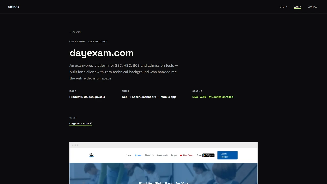
A live site with a home page, a Work archive and case study pages. Analytics runs on every page.
Testing found three mistakes of mine: unreadable nav text over big headlines, a placeholder WhatsApp link, and a “700+ users” figure I had not verified. I replaced it with the live “3.5K+ students enrolled”.